“The purpose of visualization is insight, not pictures” went the headline of a great interview with Ben Schneiderman.
To that I say: “Usually.”
Not this chart though. I made this chart – plotting how members of the Data Visualization Society (including me!) self assess their skills in three dimensions – with several purposes in mind, and they honestly had very little to do with “insight”. Instead my goals were the following:
- Make something attention-grabbing that would stand out among dozens of charts of the same data.
- Play with some new-to-me tools and techniques.
- Make something aesthetically pleasing.
- Get a blog post out of it.
Insights are great. But other stuff is good too!
How I made the chart
- The data comes from the sign-up survey for the Data Visualization Society. (If you’re into data viz, regardless of experience – join us!) The data was shared with everyone who joined the DVS, many of whom are also be trying to chart this data.
- The actual data work was done in R. I then made a quantile dot plot for the distributions of each of the three survey categories. Matthew Kay showed off some quantile dot plots in his Tapestry talk on visualizing uncertainty, which is where I discovered the chart type. Here, each point is percentile. For every 100 DVS members, we’d expect 10 to self-rate as 1.0 or lower for their data skills, indicated by the 10 teal dots from 0 to 1. The ggplot and the code to produce it is at the bottom of this post.
- I saved the ggplot as an SVG brought the plots into Figma, a design tool that I hadn’t used before. It took a lot of fiddling and even a little math to align the plots with the edges of an equilateral triangle. Here’s a link to where the chart was after Figma. (I first tried to do this step with Google Drawings before switching to Figma.) I’ve been wanting to experiment with charts are on tilted axes since getting inspired by Info We Trust by RJ Andrews. But while RJ’s connected scatterplot uses the title to enhance insight, my use actually makes it harder to understand the data!
- I then exported the work from Figma as an SVG in order to animate the chart using CSS. This was also a new experience for me and it took a lot of fiddling. My starting point for how to spin the chart was this Codepen example. The rotation makes it even harder to draw genuine insight from the chart. Good thing that’s not the point.
- Finally, I brought the SVG and CSS code back into R with the
htmltoolspackage, so I could include it in this blog you’re currently reading, which was made using RMarkdown and blogdown.
library(tidyverse)
dvs <- read_csv("https://raw.githubusercontent.com/emeeks/datavizsociety/master/challenge_data/dvs_challenge_1_membership_time_space.csv")
dvs_colors <- c("#22B3A6", "#DDB42B", "#B275AD")
percentiles <- function(x) quantile(x, seq(0,.99,.01))
dvs_levels <- c("data","visualization", "society")

dvs_chart <- tibble(data = percentiles(dvs$data),
       visualization = percentiles(dvs$visualization),
       society = percentiles(dvs$society)) %>%
  gather("key", "value") %>%
  mutate(key = factor(key, levels = dvs_levels)) %>%
  ggplot(aes(x = value, fill = key)) +
  geom_dotplot(binwidth = 0.33, dotsize = .5) +
  facet_wrap(~key, ncol = 1) +
  scale_fill_manual(values = dvs_colors) +
  theme_minimal() + theme(legend.position = "none") +
  theme(panel.grid = element_blank(),
        axis.text.y = element_blank(),
        axis.title.y = element_blank())

dvs_chart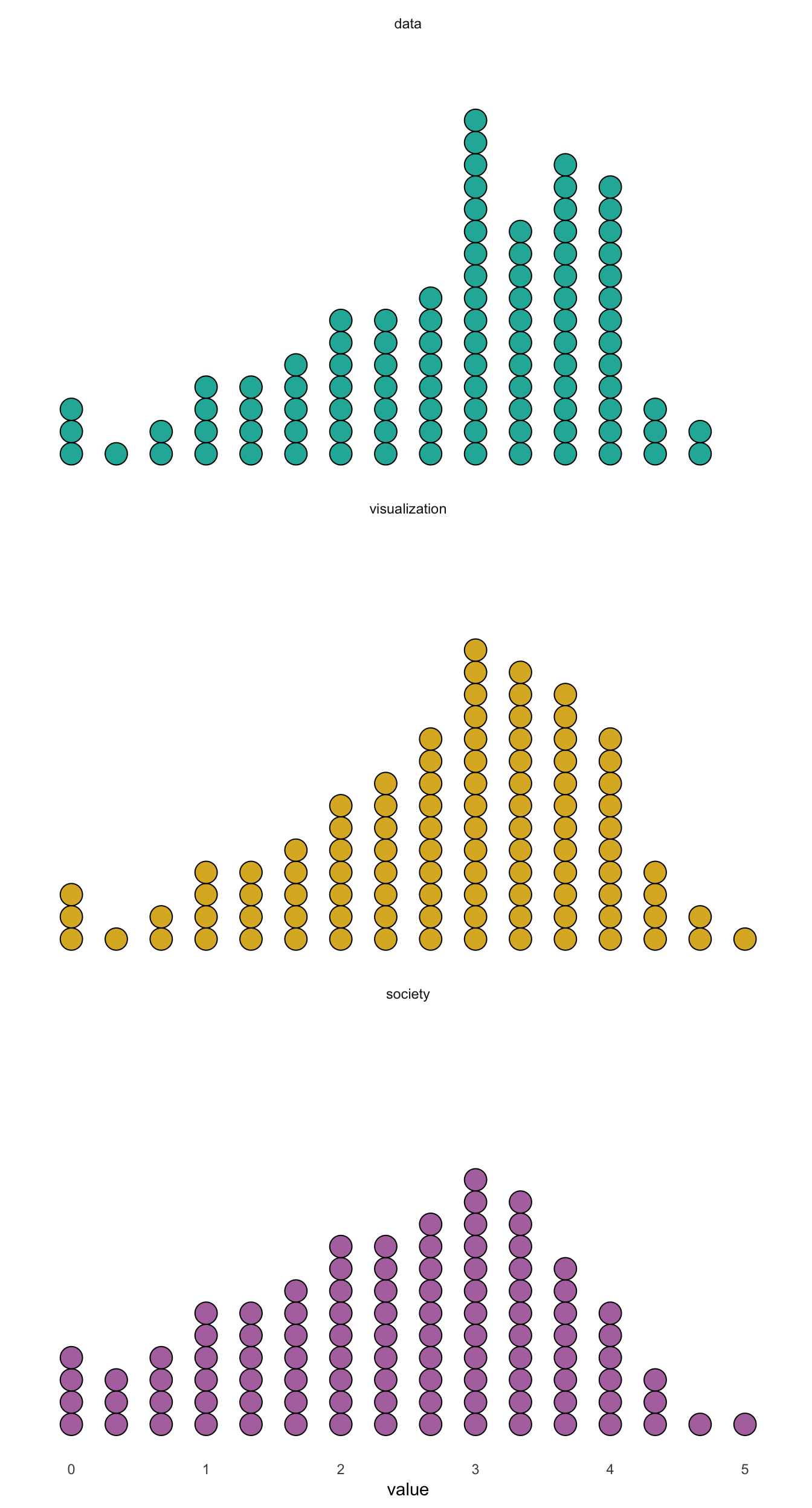
And here’s the CSS to animate:
      body {background-color: #E5E5E5}
      svg {
        animation-name: spin;
        animation-duration: 7000ms;
        animation-iteration-count: infinite;
        animation-timing-function: linear;
        transform-origin: 400px 315px;
      }

      @keyframes spin {
        0% {
          transform: rotate(0deg);
        }
        16.66% {
            transform: rotate(-120deg);
          }
        33.32% {
            transform: rotate(-120deg);
          }
        49.98% {
          transform: rotate(-240deg);
        }
        66.64% {
            transform: rotate(-240deg);
          }
        83.3% {
            transform: rotate(-360deg);
          }
        100% {
          transform: rotate(-360deg);
        }
      }